Personal
Stardew Companion
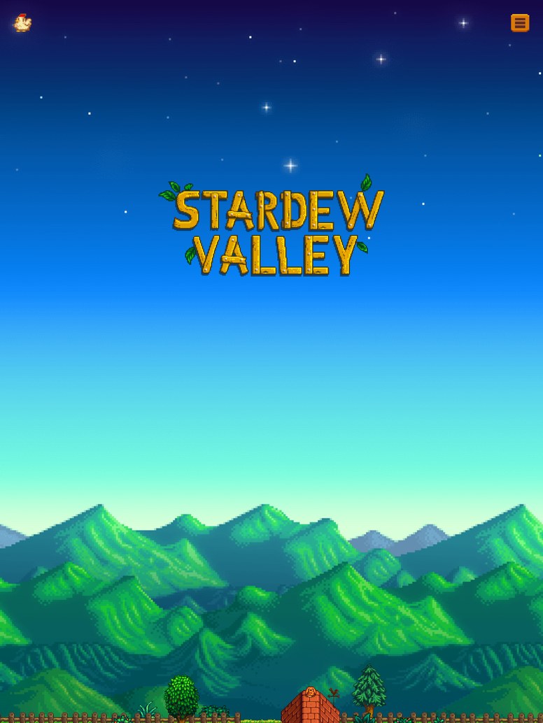
A single-page fan guide: look up any villager's favourite gifts, click around town to learn what each building is for, and pick up a fact on the way past. No framework and no build step, styled closely enough that it feels like it belongs in the game.
The wiki is complete and unpleasant
Everything about this game is documented somewhere. The problem is that the documentation is a wiki, and a wiki is optimised for completeness rather than for the question you actually have, which is almost always “what does this one person want”, asked while the game is paused.
So the whole design brief was: one page, no navigation, answer that question in under three seconds.
Borrowing a visual language without stealing assets
The thing that makes it feel like the game is not any single asset. It is the palette, the chunky border radii, the drop shadows on the panels and the specific weight of the type. Get those right and hand-drawn elements read as belonging; get them wrong and a real asset still looks pasted in.
No build step is a constraint I set on purpose. A fan guide that needs npm install to change a gift list is a fan guide that stops being updated.
Pastiche is a discipline
Matching an existing visual language closely is much harder than designing freely, and much better practice. You cannot fall back on taste; you have to measure what is actually there and reproduce it, which is the same skill an audit of a design system needs.