Personal
UI/UX Case Studies
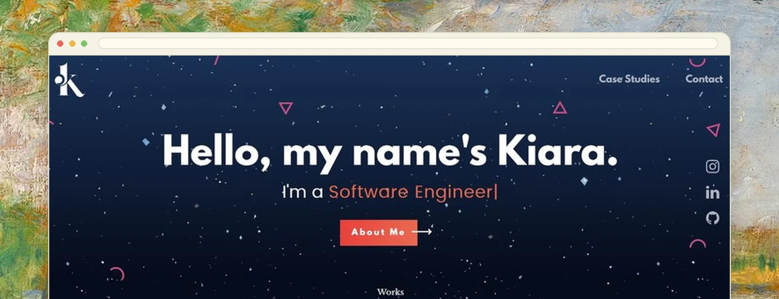
An earlier portfolio, built around research and process rather than final screenshots. Each piece walks through the problem, what was tried, and what actually shipped, which is the format I still think is right and the reason this site looks the way it does.
A grid of final screens says nothing
Most student portfolios are a grid of finished screens. They show that you can make something look good, which is the least interesting thing about design work and the easiest to fake.
What a reviewer actually wants is the middle: what you tried, what you threw away, and why. That is the part nobody publishes because it is the part that is unflattering.
Four problems, deliberately unalike
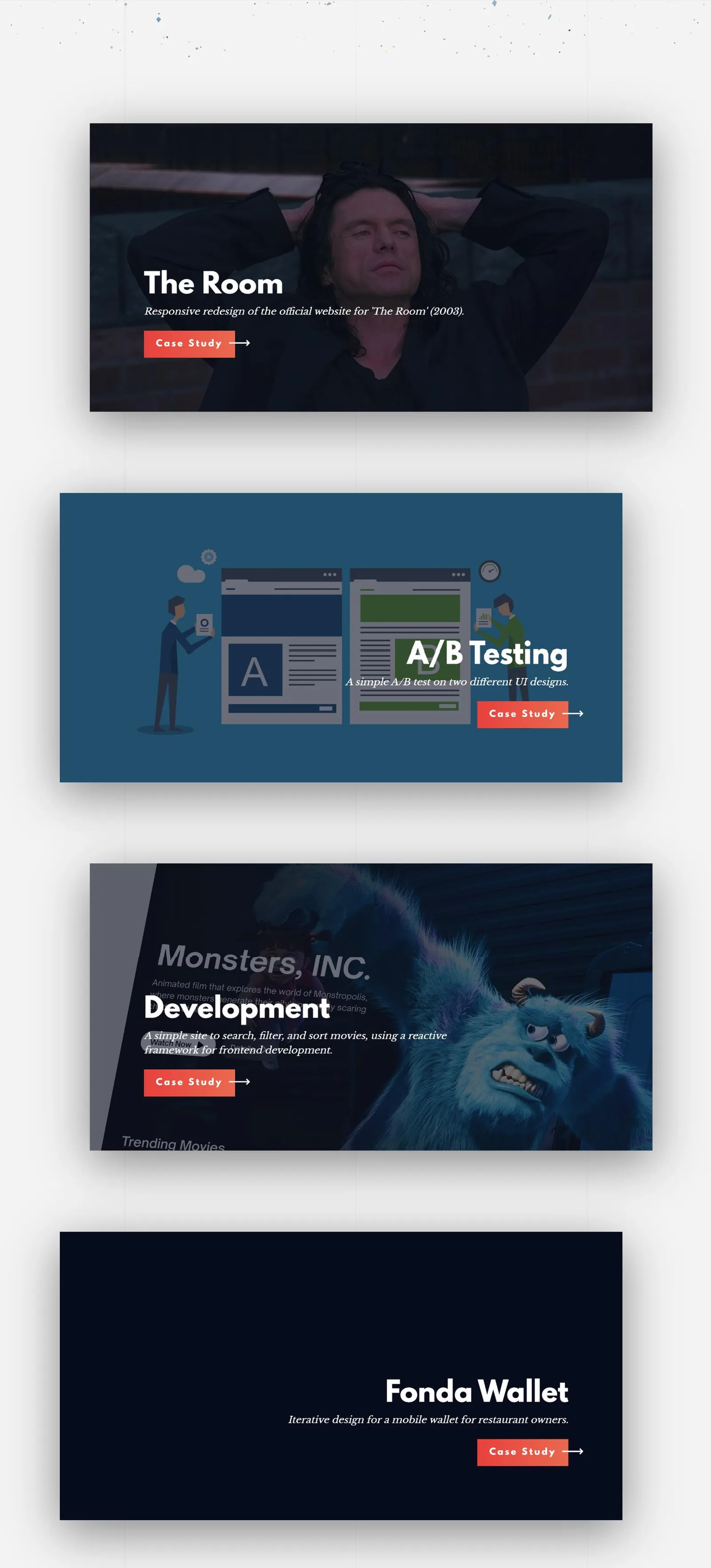
Four case studies, chosen so they do not all demonstrate the same skill. One is quantitative, one is competitive research turned into a build, one is a redesign with a sense of humour about itself, and one is a domain nobody designs for.
Process as the artefact
Every case study leads with the problem and spends most of its length on the decisions, with the final screens arriving last and briefly. The explorations that were abandoned get as much room as the one that shipped, which is the only honest way to show a decision was made rather than stumbled into.
The A/B Testing study is the clearest case. Two booking flows, three hypotheses written before the data came in, and a t-test and a chi-squared test that decide them. The finished screens are on it twice, near the top; everything after that is the reasoning.


Framework-free output, non-repetitive source
The shipped site is plain HTML, CSS and JavaScript with no framework and no pipeline, which is the right answer for five static pages. The trouble with five static pages is that the nav, the footer and the about card exist five times each, and hand-editing one text change in five files is how they drift apart.
So the source is not what deploys. The shared pieces live once in a partials folder, the page sources reference them with include markers, and a small Node script assembles the flat static files that actually ship. The output stays framework-free; the source stops being repetitive.
This site does the same thing for the same reason, with Python instead of Node and considerably more generated. That is not a coincidence, it is this project's idea kept.
The format that survived
This is the direct ancestor of the case studies on this site: problem, then the two or three choices that were genuinely hard, then what changed. Two portfolios later I have not found a better shape.